-
Monumental Grotesk
Concrete & Art-Deco
Graphic 1930 shapes Decorative
Expansions
Monumental Grotesk in short
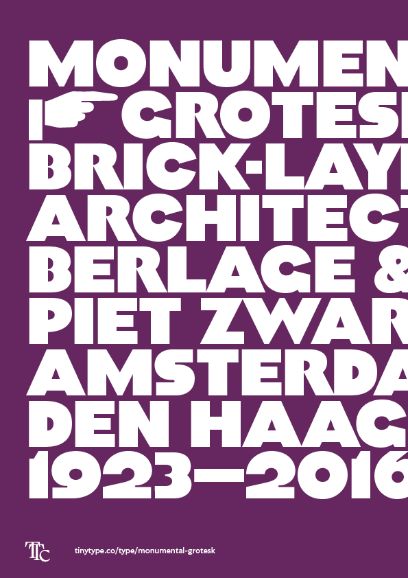
Monumental Grotesk is a loving revival and expansion of a classic The Hague vernacular set of letters, turned into a big and bold typeface for uses well beyond the original intent. Its art deco forms, together with its extreme weight and relative size, makes it a perfect choice for high-density typographic design and almost architectural sculpture.
Behind the design
Piet Zwart, a Dutch Bauhaus-inspired graphic designer, originally came up with the shapes that inspired Monumental Grotesk. He produced a set of stone letters for some buildings and a commemorative monument in The Hague, all designed by the architect Hendrik Petrus Berlage.
Graphic versus typographic
Monumental Grotesk straddles the line of typographic versus graphic shapes. Some of the letters are, quite plainly, out of proportion or weight with the others, and this might take away from a certain amount of balance. But these same letters are also explicitly more graphic, more geometric or more expressive, and that is where the life in this typeface comes from.
Zwart used a similar type style for a range of posters he designed for a rubber floor manufacturer, but where that style looks severe, the variant for Berlage is almost cosy. The contrast is lower, the corners are less sharp, and generally the design feels a little more physical.
Alternate diacritic style
The default style of diacritics is placed above the glyphs, but an OpenType stylistic set cuts the diacritics to be inset into the glyph.
