-
Tiny Grotesk Light
NEOGROTESKS ARE EMPTY CANVASES, ANONYMOUS – but EMPTY CANVAS
-
Tiny Grotesk Regular
How many things must a neogrotesk be today? And how few? New neogrotesk
-
Tiny Grotesk Medium
TINY GROTESK wants to be many things, but at small scale. Friendliness &c.
-
Tiny Grotesk Bold
How friendly can something ‘generic’ really be? How kind? Tiny but also big
-
Tiny Grotesk Narrow Light
The ideal use case for the narrow styles? Footnotes, sidebars, UI elements Footnotes & sidebars
-
Tiny Grotesk Narrow Regular
THE NARROW STYLES OFFER UNCOMPROMISED ECONOMY OF SPACE ECON’MY of SPACE
-
Tiny Grotesk Narrow Medium
As a set of companion styles it also doubles your options for emphasis 8 companion styles
-
Tiny Grotesk Narrow Bold
✎ And within that footnote microtypography, you have wide range Microtypographic
-
Tiny Grotesk Wide Light
When you design for big size, you might as well commit BIG USE ONLY
-
Tiny Grotesk Wide Regular
The wide styles are proudly limited to BIG USE ONLY Go big or else
-
Tiny Grotesk Wide Medium
Wider styles demand space — so give them space Give it space!
-
Tiny Grotesk Wide Bold
GO BIG OR GO FIND ANOTHER FONT, I GUESS! Commitment
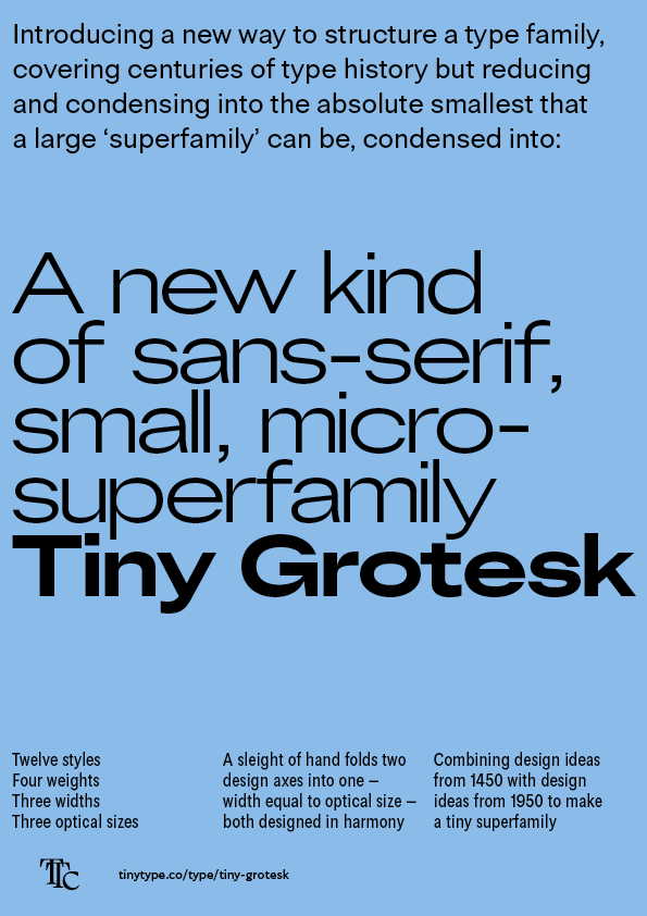
Tiny Grotesk in short
Tiny Grotesk is a modern neogrotesk. For most purposes we could stop right there. But there’s a story behind the design and family structure, a story of bridging 500 years of type history.
The look and feel of Tiny Grotesk is primarily a mid-20th century neogrotesk, in the tradition of Helvetica, Univers and Folio. The terminals are cut at horizontal and vertical lines, the strokes are monolinear in feel, and the lowercase is quite even in its proportions. The uppercase is a bit more variable in its proportions, a bit more classical, but still comfortable and familiar.
Where the family becomes complex, and much more widely usable, is with the two other widths. These two widths also double as optical sizes: Narrow is meant for small use, and Wide is meant for big use.
Narrow has ink traps and other design optimisations that keep the letters readable and distinct at very small sizes. The spacing and proportions also reveal a bit of a trick: they follow the lowercase rhythm of Aldus Manutius’s and Ludovico Arrighi’s italics from around the year 1500, as seen for example in Dante’s Divine Comedy. It turns out that the textural rhythm of a 1500s italic handwriting style still holds up 500 years later – this time dressed in the clothes of a neogrotesk.
Wide is optimised in the opposite direction. Spacing is hair-tight, and connections inside letters are exaggerated with high-contrast stroke detail. This makes it work best at larger sizes. And you better know what you want, because the Wide styles, meant for large use, demand even more space with their width. It involves a kind of design commitment that only comes with smaller type families: if you want to go big, you better go huge.
Exploring proportion
A high priority in almost all type design is proportion. A set of well-drawn letters will still fail when set with poor rhythm. Tiny Grotesk is the tiny sans superfamily that changes what rhythm you can expect from a neogrotesk.
The family consists of three sub-families: Narrow, Regular and Wide. The narrow subfamily is modeled after the proportions of 15th century italics, and the regular has a more evened-out rhythm, more fitting to the 20th century. The wide subfamily is about 1,5 times wider than the narrow, and provides a third tone to the family. The styles cover a broad range of design needs, and they all combine to produce a novel typographic palette with a lot of design opportunity, without overwhelming the designer with options.
The Narrow styles, due to their more generous spacing, excel at smaller sizes. They scale down very effectively. Conversely, the Wide styles, which are spaced more tightly, could take the role of the ‘display’ face. As a set, this means you can use the width of the styles as a size variable: the narrower the font, the smaller it can be used.
A wide range of use
Tiny Grotesk is spreading ideas out across a wide range – widths, optical sizes, the neogrotesk as a do-it-all, and even 1500s Italian calligraphy. These ideas come together in a compact family that has a few explicit goals. Provide as much range as possible with as few options as possible. Provide a deeply typographic family for use across print, interfaces, identities and more. Provide typographic depth with language support and a range of characters that celebrate text as interface.
The two first goals are illustrated across this page already. The third one is worth sharing here, too.
With this final conceptual extension, Tiny Grotesk is indeed a tiny superfamily, equipped to tackle a wide range of documents, interfaces, rich texts and complex structures.