-
Dover Serif Text Regular
ABSURDITY, n. a statement or belief manifestly inconsistent with one’s own opinion. Absurdity
-
Dover Serif Text Italic
DEBAUCHEE, n. one who has so earnestly pursued pleasure that he has had the misfortune to overtake it. Debauchee
-
Dover Serif Text Bold
DECIDE, v. i. to succumb to the preponderance of one set of influences over another set. Decide
-
Dover Sans Text Regular
RATIONAL, adj. devoid of all delusions save those of observation, experience and reflection. Rational
-
Dover Sans Text Italic
ECCENTRICITY, n. a method of distinction so cheap that fools employ it to accentuate their incapacity. Eccentricity
-
Dover Sans Text Bold
SELF-ESTEEM, n. an erroneous appraisement. Self-esteem
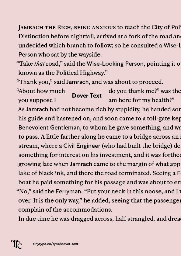
Dover Text in short
Dover Text is the natural companion to Dover Display: where Display is best used big, Dover Text shines at sizes down to 8 points, or 12 pixels. The six styles work together in ways that William Caslon could never have imagined in the 18th century.
People commonly label families consisting of paired sans and serif styles as ‘superfamilies’, and Dover Text is the smallest possible example of a superfamily. The ‘super’ in this family comes from the complete pairing of the serif and sans designs. The sans can be used as an emphasis style for the serif, for example, and all the functionality of the fonts is identical. Small caps, tabular numbers and language support are matched completely.
Behind the design
Dover Serif Text
Dover Serif Text is based off of Haas Caslon, a German interpretation of Caslon’s smaller types. But where the reference material is a bit stuffy, Dover cleans up. Historic reference is indispensable for understanding some of the stranger decisions from the past, and with a thousand glyphs per font, it helps that Caslon goes far, far back. As it is, the many Caslon interpretations that exist may stand on a few centuries of history, but there is no need for a new version to look old.
Dover Sans Text
Dover Sans Text is sansified Caslon, using the same the design principles for the proportions, letter skeletons and continuing the functionality of Dover Serif Text. Certain details from Edward Johnston’s Underground type design and Eric Gill’s eponymous Gill Sans shine through, but Dover Sans Text references more of their sketches and lettering than any final fonts. Notable examples of design updates to these sans serifs are shapes like the lowercase a tail, which is much more in line with the overal alphabet, and the flowier italic, best exemplified by the e.
Two other meaningful differences are the increased x-height of the fonts, matching the bookishness of the serif, and the low contrast of the bold weight. Together, these three styles do what most book typefaces need.
