-
Dover Serif Display Regular
Extravagantly lush detailing Intercontinental
-
Dover Serif Display Italic
Curvaceous, sharp, crisp, smooth Quasi-English look
-
Dover Sans Display Regular
Indicating left, right and down Humanist warmth
-
Dover Sans Display Italic
Franklin, Barnett, Crick, Watson Organic and gentle
Dover Display in short
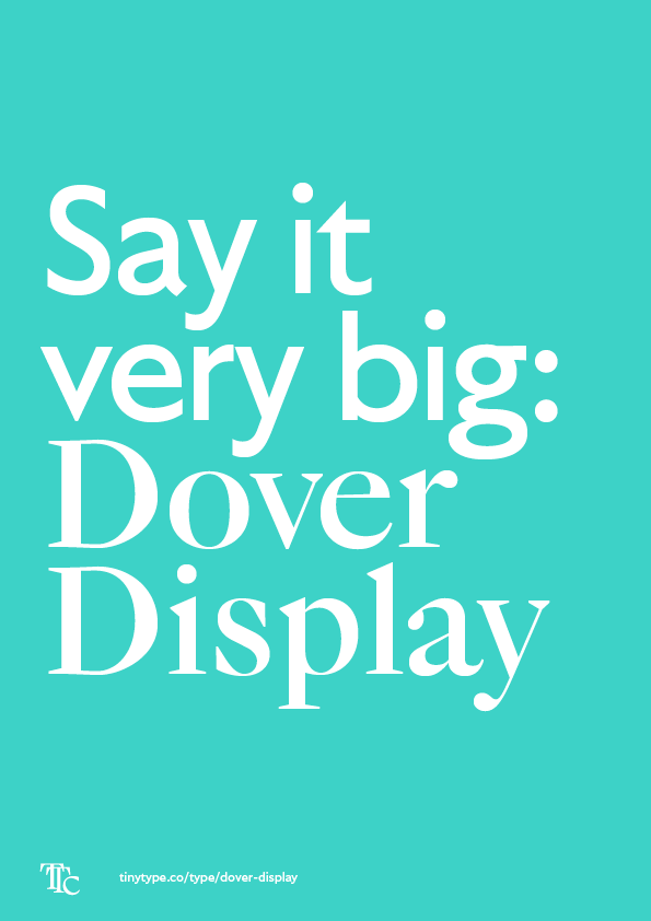
Dover Display is a tiny family that explores the classic British typefaces, but updates them for a new generation. It consists of only four styles, but all of them work hard to compensate. The Serif styles lean into their baroque curves, and the Sans styles display a strong humanist sense of elegance and smoothness.
The typefaces support our default set of languages – over 200 – and come with contextual alternates to avoid collisions, many alternate number styles, alternates for some glyphs, and much more. More detail can be found in the technical information section.
☞ See also: Dover Text, the logical extension to the family.
Behind the design
Dover is a long-running exploration of the quintessential British types. It is an attempt at historical design fiction: what if Caslon and Gill Sans had been designed by the same person? What if that person were me?
It may seem a bit arrogant, but every revival, digitisation, homage, re-evaluation, cover version, new arrangement, translation is a new version of the old thing, the same but different. With that mindset, anyone should be able to make new interpretations. Similarly, the validity of a Dutch designer rewriting English classics might be questionable, but at the same time an outsider sees things with different eyes.
Defaults don’t have to be boring
Caslon has long been considered a kind of ‘default’ serif. There’s even an old typesetter’s saying – “when in doubt, use Caslon”. But this implies a particular lack of remarkability, and original Caslon drawings are by no means unremarkable. The larger sizes sparkle off the page, and the italics are incredibly curly and dynamic. The upright capitals are crisp, large, imposing, and the lowercase has a lot of warmth. The pairing of Dover Serif Display in its Regular and Italic embraces these features, and tries to remind you that maybe Caslon isn’t that default. Maybe Caslon can be very exciting.
Translating serif to sans
Dover Sans Display plays a similar role. It is a direct humanistic sans variation of the Serif subset. It takes some of the good ideas of Gill Sans, another ‘default’ face, but works hard to optimise it for big use in a way that harmonises with the Serif styles. Surprisingly, many features of Gill Sans seem directly quoted from Caslon types. With that principle in hand, it was easy to give the Sans subset a place in the family.
