← Back to news → Monumental Grotesk
Design notes: Monumental Grotesk

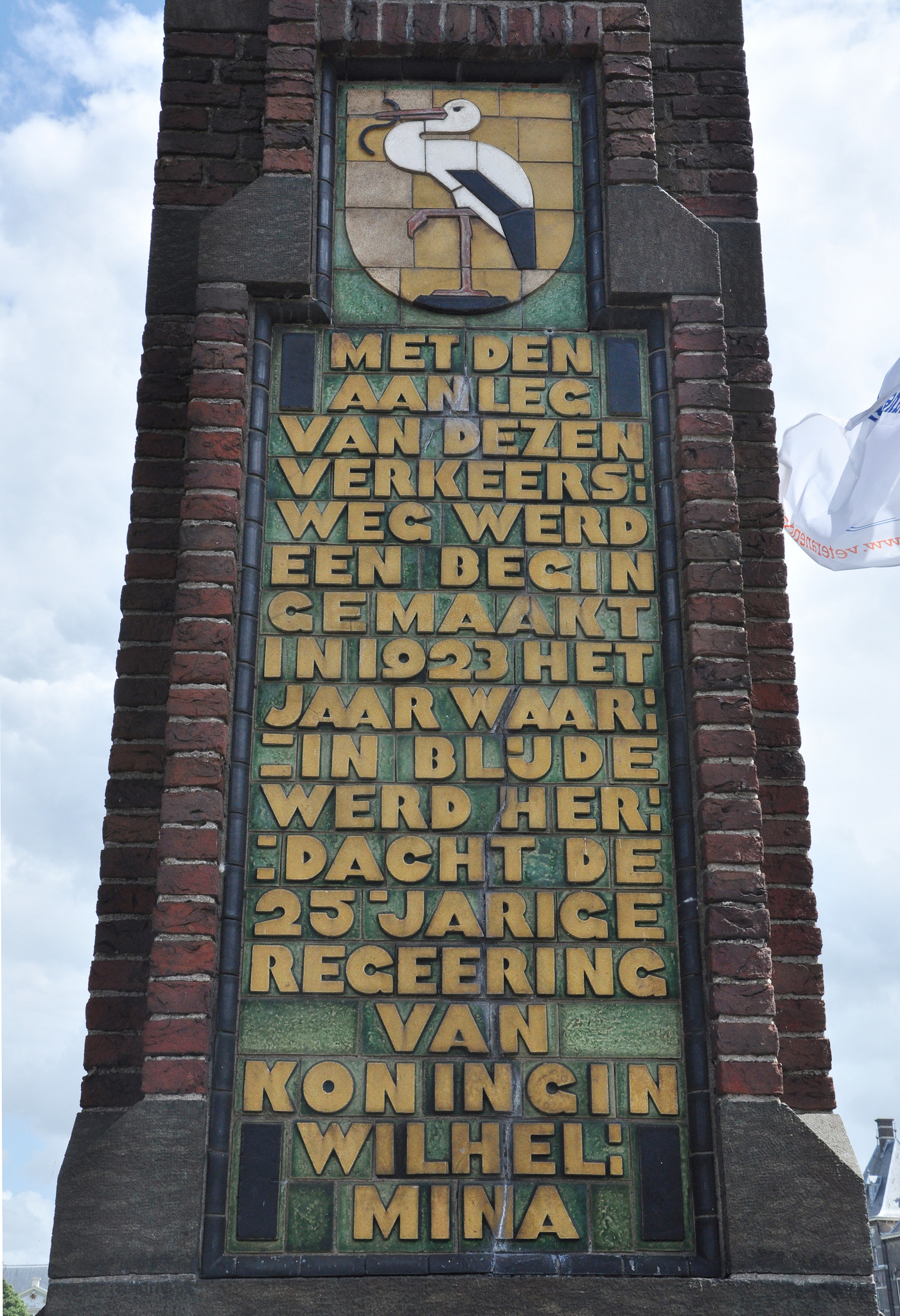
Photograph by Nina Stössinger.
Monumental Grotesk is a revival of the spirited lettering work of Piet Zwart. Most of his typographic work is different for each project, and is thus more like lettering. In Monumental Grotesk, the typographic core is given centre stage: now, it really works like a typeface.
Piet Zwart was one of the first proper Dutch graphic designers. He was a graphic artist, working with stylised photography, letter sorts in lead and wood and minimalist layouts, in an era where Art Nouveau was just wearing off. Art Deco and its cousin Bauhaus laid the foundations for twentieth century graphic design.
When Hendrik Berlage designed his buildings, all laying the ground work for, among others, De Stijl and the Amsterdam School, he commissioned Zwart to design the lettering.
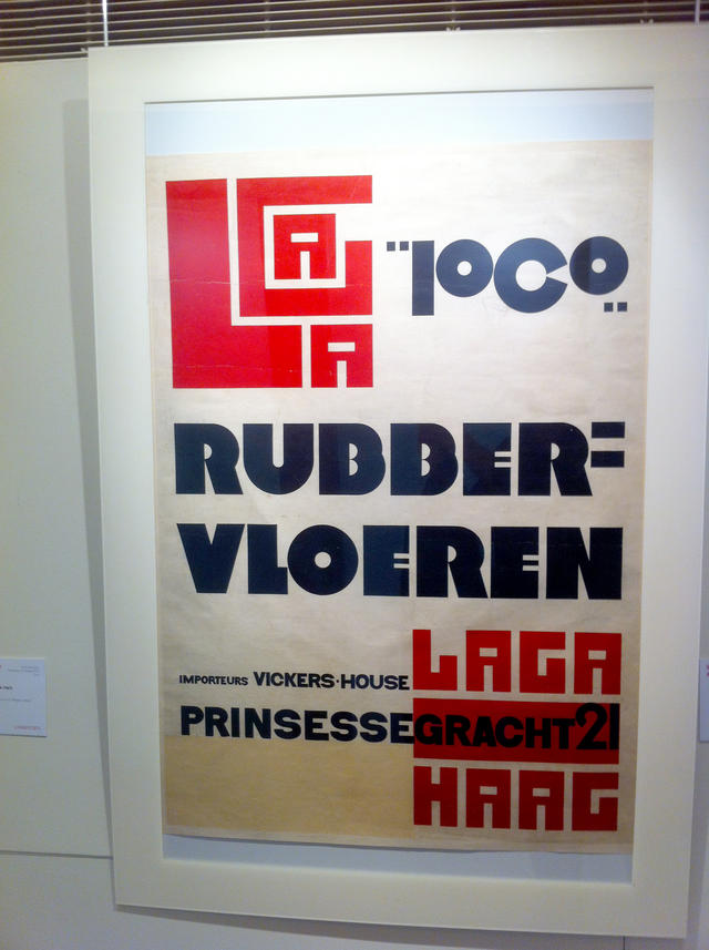
This style, which we’ll refer to as the Berlage letters, has a softness that is perhaps uncharacteristic for Zwart’s regular graphic design work. Nonetheless, it is clearly his product. They were drawn around the same time – the Laga poster was printed in 1922, and the monument on Buitenhof was erected in 1923. The lettering on the façade of the First Church of Christ, Scientist was delivered in 1926; Piet Zwart even collaborated on the interior design.

Photograph of an original poster, by David Watson.
Where the Laga font—seemingly made with left-overs of linoleum—has a rough but mechanical quality to it, the Berlage letters are soft, almost too soft for the hard material they came to be cut in. The reasons for the sharpness of Zwart’s poster work are obvious: he worked in linoleum and letterpress, materials that are hard-edged and of high contrast. Perfect materials for a modernist who is trying to throw off the yoke of the overly decorative arts, attempting to inject some heart and soul into abstract imagery. The Berlage letters, which I believe are sculpted and enameled (please contact me about this if you know better), achieve this. They have an inherent softness due to their finish, and their dimensionality feels entirely natural.
And this is the appeal, to me: a grotesk cut in an era of brutally geometric designs, based on a similarly coarse, fat grotesk, but stripped of its rough edges, and in fact turned into a friendly face.
Acknowledgements
Without the support of Just van Rossum and Erik van Blokland, I might never have started. Without the support of Håvard Gjelseth, I might never have finished it. Florian Hardwig provided me with words of support and pointed out that maybe a flat-topped 8 could be a pretty cool design. I agreed completely.
☛ See and buy Monumental Grotesk, starting at only €40 per style