← Back to news → Dover Display
Dover: a look at the quintessential English typefaces
After four years of design work, I’m proud to present Dover Display, a type family based on a simple theory: what if Caslon and Gill Sans had been designed by the same person? What if that person were me? What follows is the origin story of this project.
Typography is concerned with the use of typefaces to elucidate an idea. Normally, we use an upright, roman style for the primary text. Then, we add layers of meaning, using italics, small caps and bolder weights. But then, when we exhaust the design possibilities in the first typeface family, the fun starts. We start matching.
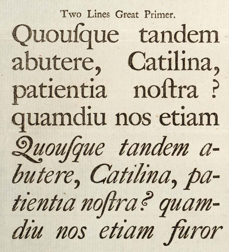
Fig. 1
The cut of Caslon that influenced Dover the most.
A good combination of typefaces is more than just practical: it can enhance the idea, the feeling and the branding of whatever you’re designing. Think of it like cooking: a single flavour can be delicious, but more often than not, what we consider a good flavour is actually a complex layering of different flavour compounds that work well together.
So you can imagine that designers pride themselves in their skill at matching the right typefaces. This is where Dover started.
A strange match
While typesetting a zine, I tried to match sans and serif faces, to make the most of a very cheap print. A lot of combinations are problematic, such as wildly varying vertical proportions — when you need to massively adjust the font size just so the sans doesn’t look shouty next to the serif, for example. I skipped over Caslon and Gill Sans similarly. The digital versions that we have available are all a little mismatched and often need a fair amount of adjusting.
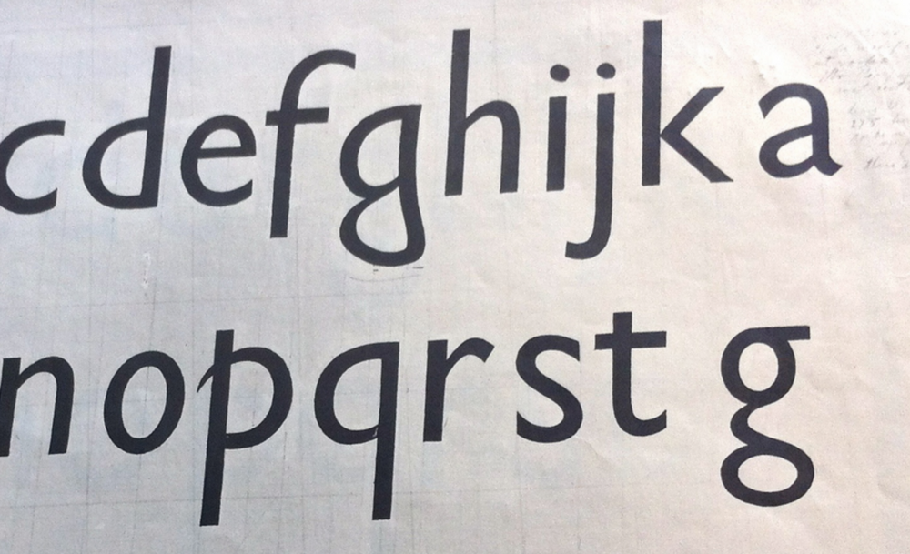
Fig. 2
The Gill Sans drawing that motivated my ‘a’: the tail seen here is much more confident and in line with the rest of the character set. (source)
But something stuck about the combination. I kept returning to it. I noticed, after some time, that the proportions of the capital letters were eerily similar, almost as if Gill Sans had modelled its caps off of Caslon (fig. 3). And I noticed the same for a large part of the lowercase. The whole thing… it seemed too coincidental. As if Gill Sans was a ‘Caslon Sans’.
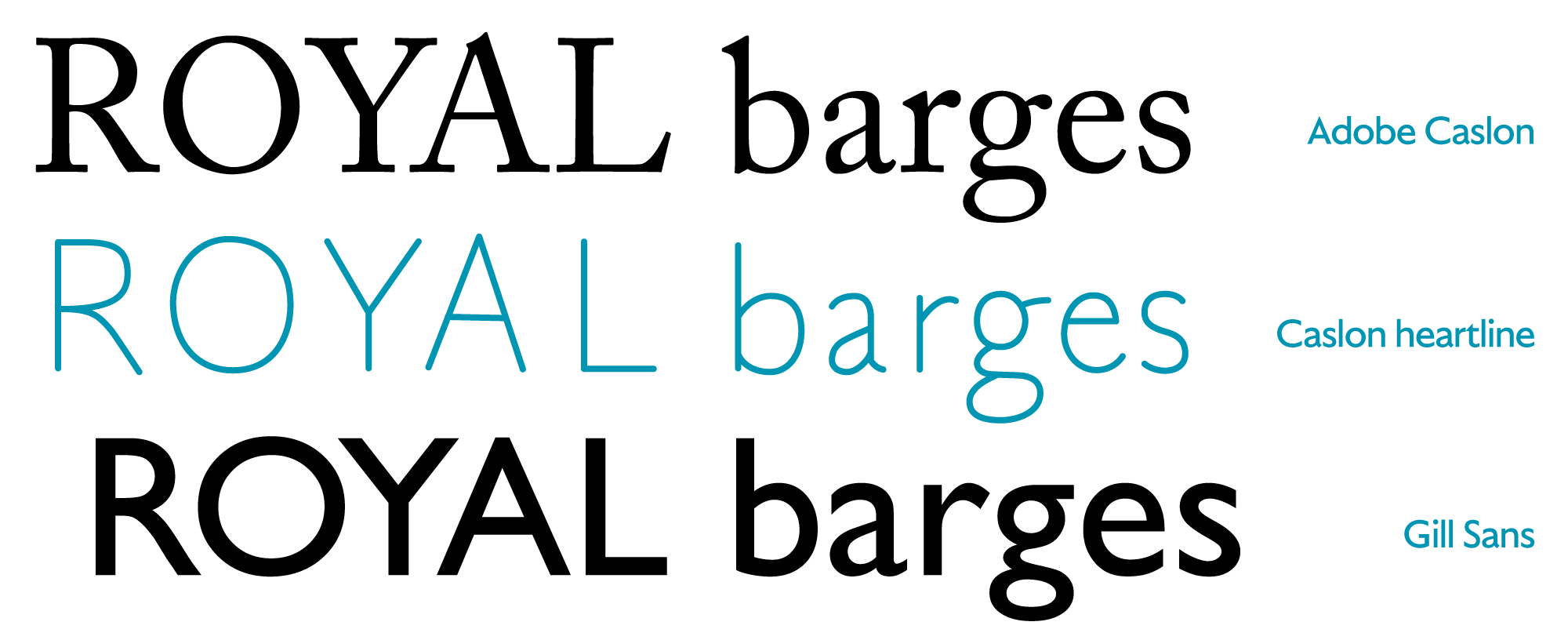
Fig. 3
Shown here is Adobe Caslon, followed by a rough tracing of its heartline, and finally Gill Sans. We can argue about the differences, but the similarities are strong.
While I have found no evidence that Eric Gill did indeed follow the Caslon skeleton, or perhaps followed the English ‘archetype’ (Caslon has been and remains a wildly popular typeface), it planted the seed for Dover, years before I actually started drawing it.
Years of drawing
In 2012, I began drawing ‘my’ Caslon. A friend asked me if I had ‘anything lying around’ that was high-contrast but not Didot-esque. I didn’t, but it sounded like a fun challenge. I started with some light research and came back to Caslon, particularly the poster sizes that William Caslon drew for his eponymous type foundry. I remembered my previous attempts to combine Caslon with a nicely matched sans and failing. Now I had a real problem to solve.
I quickly split the production into two extremes: really big use, and small general use. Dover Display would be the branch for the biggest, most expressive design work, and Dover Text would be used for general text settings. With that, I was able to focus on emphasising the design idea I’d had all along: to make Caslon and Gill a family.
A matter of need
The easiest way to figure out what to draw first is to ask yourself what you need first. What I needed most was a display family: something big and bold, for titles, features and call-outs.
Now, on the surface, it may seem like a blessing for a graphic designer to also make their own typefaces. The reality of it, however, is that you are split doing catch-up work on both parts. A new poster highlights a kerning issue, a book cover reveals that you need some esoteric characters, a website shows that the rendering doesn’t look good on Windows. They call that ‘dog fooding’, where the producer of dog food believes so much in their own product that they eat it themselves. As you can imagine, if you’re into fine dining, that may not be so appealing. Such is life for the type-designing graphic designer.
So I had to get strict with myself. In the summer of 2014, after two years of drawing, I decided to delay Dover Text. All my drawing time should go into Dover Display instead. The two matters of need? I wanted a less baroque Caslon, and a Gill Sans for big use.
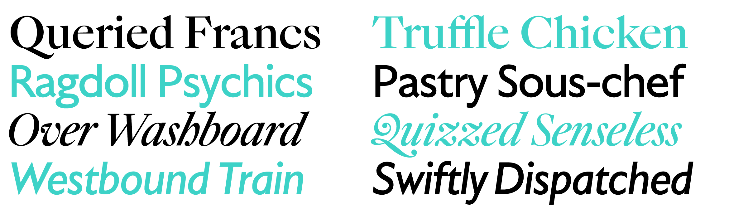
Fig. 4
The serif styles of Dover Display are a rationalised version of Caslon’s ideas, and the italic, while still quite wobbly and curly, is much more straight-laced. The sans counterpart is a more generally useful execution of Gill Sans: the x-height is taller, and the weight is distributed more like a modern humanist sans-serif. I like to think that I addressed my needs.
Dover: a piece of historical design fiction
On July 1st of 2016, I finally released Dover Display. An exploration of how to match serif and sans, based on a years-old hunch that, maybe, sometime in the 1920s, Eric Gill looked at the Caslon types with a tilted head and thought to himself, ‘I want something big and bold, but not too baroque’, and started drawing. This is my design fiction: what if?
Dover Display is available starting at €50 per style, exclusively from the Tiny Type Co.